Contact
Audrey Riley Art
  • Blog
  • Portfolio
  • About

Oh, I love it when I’m wrong: Part Two.

8/24/2016

0 Comments

 
Picture
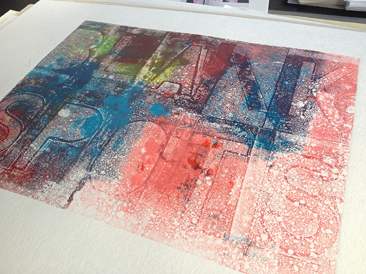
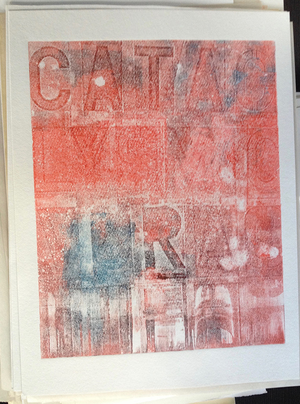
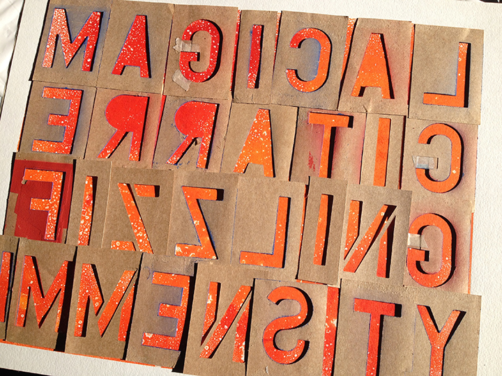
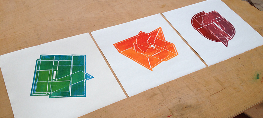
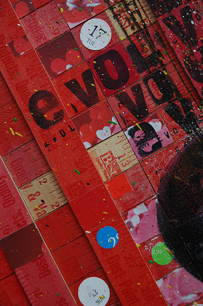
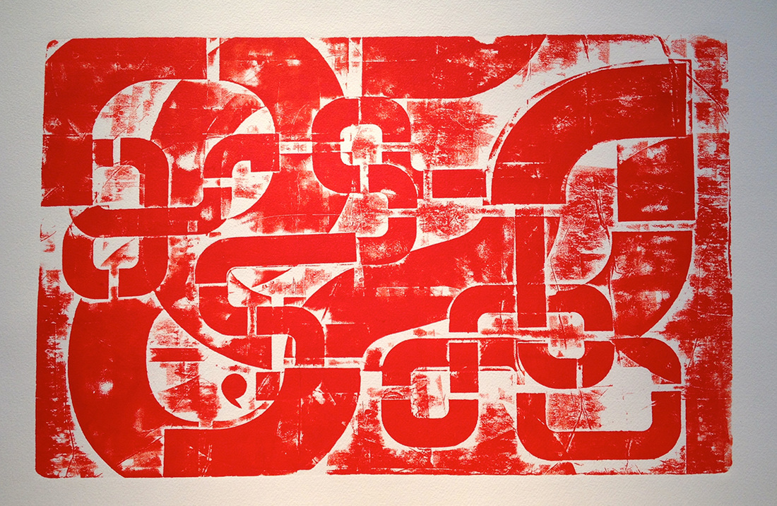
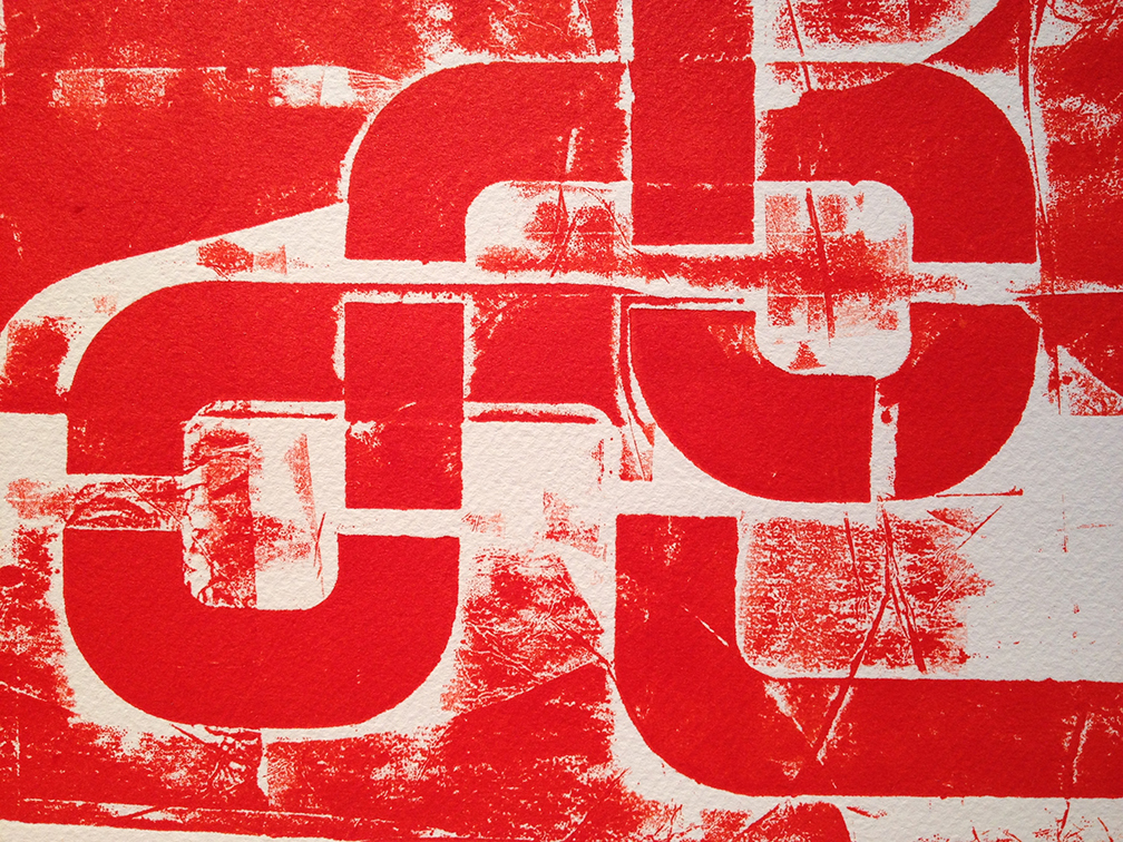
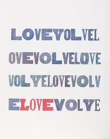
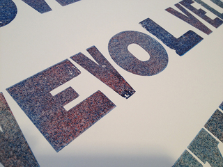
​Well, the best kind of surprise occured when doing what is called a “ghost print.” The rest of the class got a chuckle when I about lost my mind over it. If I hadn’t been there to see how it happened I would never have figured the process. 
Picture
Picture
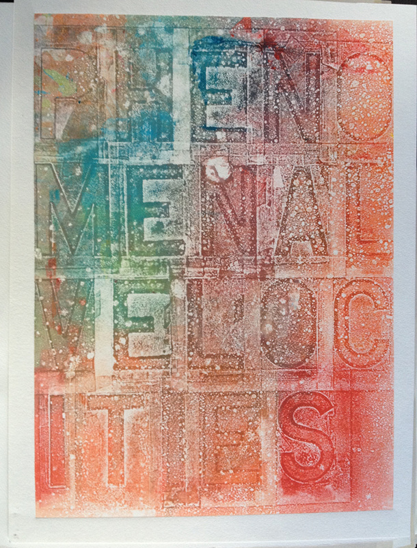
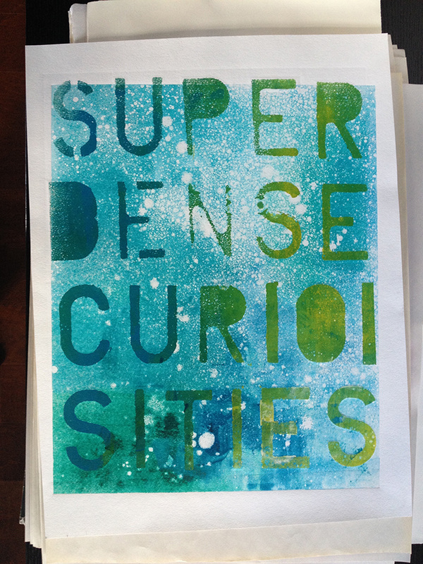
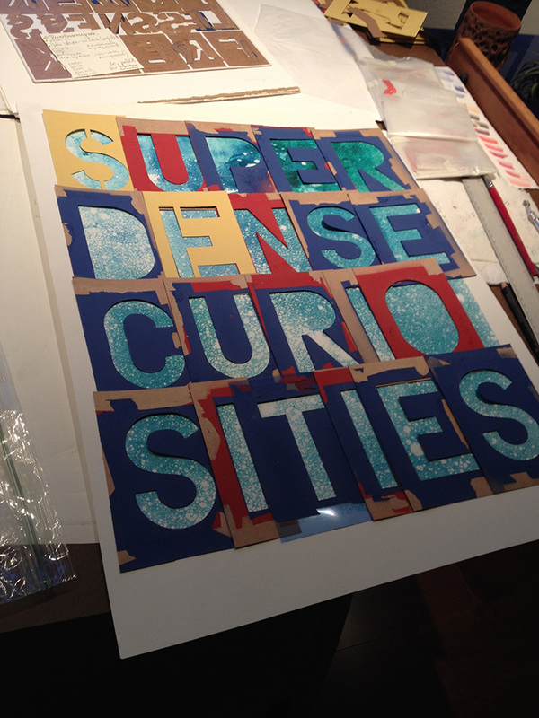
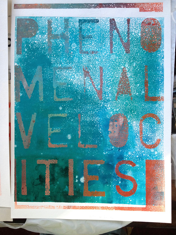
​A “ghost print” is a print you can make once you have completed the intended print. You send the plate through the press again as it usually has enough ink on it to make one or two ghost prints. With these works, I took off the stencils and then made the ghost print. That’s why the magic happened. Edgar Degas is known for making gorgeous ghost prints. I didn’t make this up!
Picture
​What a gift that student gave me. And what a surprise birthday party sort of a thing art is. Never quite knowing how something is going to turn out and then getting to see how it turns out, well, I can’t get enough of it. And I can’t wait to be wrong again.
Picture

Picture
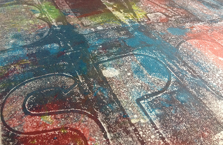
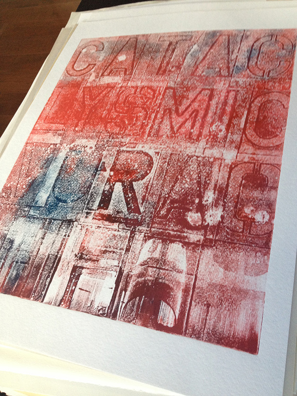
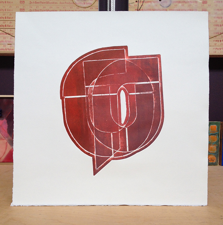
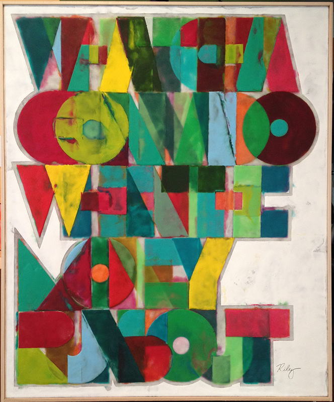
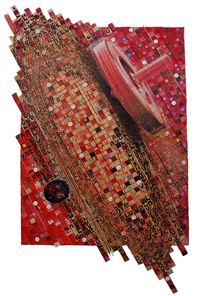
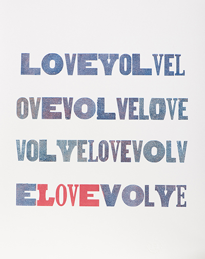
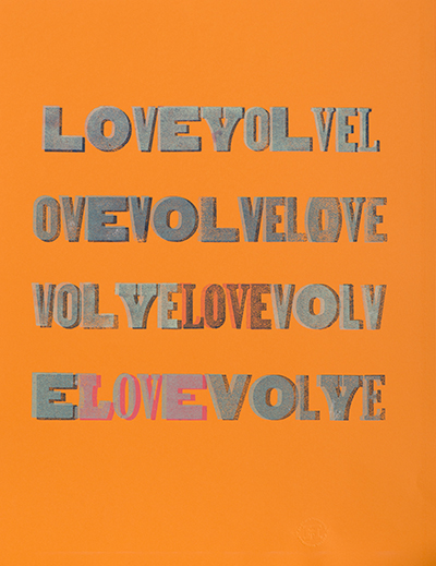
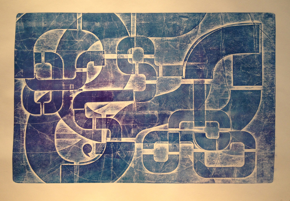
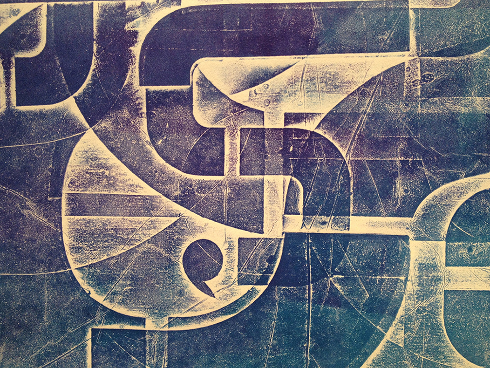
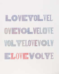
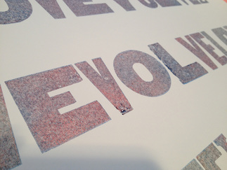
The example below is of a ghost's ghost. 
Picture
0 Comments

Oh, I love it when I’m wrong: Part One.

8/17/2016

0 Comments

 
​The last couple winters I have taken a printmaking class. One of my classmates saw my palette and loved it. She suggested I try something she does. What the heck.
 
I made four prints and contemplated them for weeks. My classmate prints on top of them. I planned on giving them to another student; they simply were not my style.
 
One day, I read an article about black holes. The photographs looked just like my strange prints. Off I went! I became obsessed and dreamt of hogging the press. 
Picture
Picture
You can see my original spacey background through the stencils. I am in the process of designing the second layer. 
Picture
Again, you can see through the stencils to the starry background. When printmaking, you have to think in reverse. But when working with words, not only do the letters have to be positioned backwards, but so do the words. Thank goodness I figured out that my words weren’t spelled backwards before I printed this. The result didn’t thrill me. My palette for the second layer ended up too like the palette below. Darn it. I loved the words: MAGICAL ERRATIC FIZZLING IMMENSITY.
Picture
​With this next piece, something on press went awry and the stencils slipped. However, the accident was happy. The sliding letters illustrated the concept so fabulously. Something that is voracious is hungry and in space that means the entity pulls debris, stars, planets, anything into itself.
Picture
0 Comments

Sense and stencilbility.

7/20/2016

1 Comment

 
Instead of making letters and words with my stencils I decided to create an abstract piece using only parts of letters. I chose the most generic style of stencil instead of one of my own alphabets. Something architecty or engineeringy or designy (well, that’s a given with me) happened and I need to make more as soon as possible.
Picture
Picture
Picture
Picture
1 Comment

Bashtag hashtag.

7/13/2016

2 Comments

 
Picture
​Well, I don’t understand hashtags and honestly fear them. I have never searched one or placed one in an electronic correspondence. So, before I go extinct, I wanted to deal with a hashtag where I could control where it could spread . . . and just now as I am re-reading this post, silly me!
 
And, yes, I have a hidden word in here about how all of this makes me feel.
If you are the first to find it I’ll give you a print!
 
This sentiment is printed in a couple colors and even a blind emboss. It is a collagraph. If you don’t win the contest and want to purchase one, let me know.
2 Comments

Heading to the Hamptons.

7/4/2016

0 Comments

 
​Well, some of my art is anyway! 
Picture
If any of you would like to download a VIP ticket that gets you into the opening party and fair, please go here:   ​       http://artmarkethamptons.com/tickets/jenniferford-vip
​Thank yous, best wishes and cheers to finding every piece you carried cross-country a home in New York to Jennifer Ford Art and her wonderful team and collaborators. Here are a couple of my pieces that will be shown there. This a silkscreen on a reclaimed press sheet from the manufacturing process involved in making paint chips that you find at a hardware store.
Picture
And this is an encaustic. This fair has a design bent to it I think that my sensibilities will be well understood.
Picture
In my next post I plan to show the progress of five encaustics that are ready and waiting for the fair to open.
0 Comments

Thank you, DeBrand's!

1/27/2016

1 Comment

 
​​It’s no secret that I’d rather make art than talk about it. I've not been blogging as planned. It’s time to change that with a thank you to Cathy and Tim Beere at DeBrand’s for selecting my art for their 2016 Valentine’s Day boxes. 
Picture
​This is especially fun, and means a lot to me, as I’ve been friends with Tim forever and with Cathy for about as long. Cathy’s chocolates are mini pieces of art and I love (tis the season) how our passions merged in this product.
Picture
​The art on the box is a cropping of a much larger letterpress piece that they have in their Auburn Road store. Here Cathy and I are in my studio with the larger work.
Picture
​I have worked with the letters “evolvelove” for years and in many media. It interests me how “l, o, v, e” create two meaningful words that when placed together become even more thoughtful and turn into a new-fangled verb. 
Picture
Picture
Picture
Picture
​The heart boxes come in two sizes which causes me conflict. The little heart is just adorable but there are more chocolates in the big one; get both! Afterall, they have both been made with the most precious ingredient of all; love. http://www.debrands.com
1 Comment

Collage meets printmaking; what could be better?

6/5/2015

1 Comment

 
This winter I took a class to learn how to make mono prints. Fortunately, this teacher also taught collagraphy as I quickly learned that painting with ink on an acrylic surface was not for me. I work with stencils in a lot of my art and so I tried them with this medium. Hooked! This is work from my short class. I will explore more soon.

Before inking the plate I tried a blind emboss. (Thank you advertising background.) Love it. I need to build a bit higher. With a class like this I was not able to experiment with a second or third layer of ink. These monotypes are all made with one pass through the press.

Read More
1 Comment

Laziness & Letterpress

5/6/2015

0 Comments

 
My best friend and I have the good fortune to know the Assistant Director at Hamilton Wood Type & Printing Museum in Two Rivers, WI. So we took a trip there and spent three amazing days printing.

I discovered that rather than washing up in between colors that I could simply roll the new color on top of the old. After I printed what I had planned, I ran a number of pieces of paper through the press just to see what would happen. Magic!

As far as I can recall, I printed the green, then the blue, and then probably something else. Then I ran my extra sheets through the press starting with the pink one and then the two white sheets. Each pass took more ink off the letters in reverse order of how it had been layered on. It ended up that the inks mixed together on the letter which added to the excitement of the reveal.

Picture
Picture
Picture
Picture
Picture
Picture
Picture

Read More
0 Comments

    Author

    I am a mixed-media artist exploring the phenomenon between the visual and the verbal in encaustics, printmaking and drawing.

    Archives

    August 2016
    July 2016
    March 2016
    January 2016
    September 2015
    August 2015
    July 2015
    June 2015
    May 2015

    Categories

    All
    Concept
    Encaustics
    Letters
    Printmaking

    RSS Feed

Copyright © 2015 Audrey Riley