Contact
Audrey Riley Art
  • Blog
  • Portfolio
  • About

Inspired Alphabet

7/3/2015

0 Comments

 
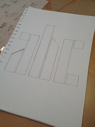
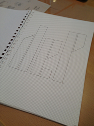
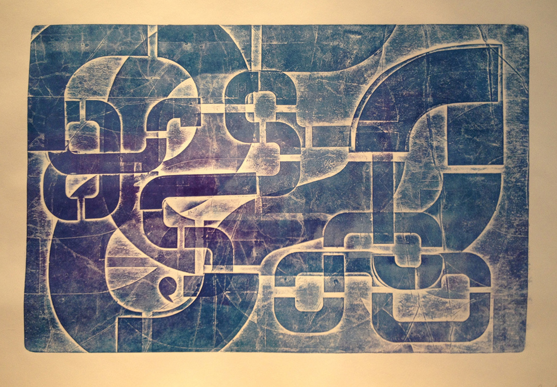
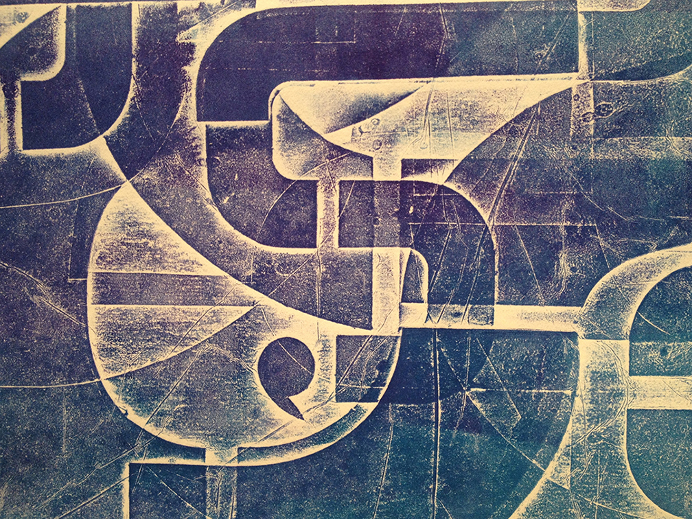
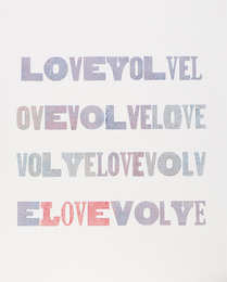
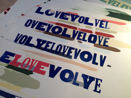
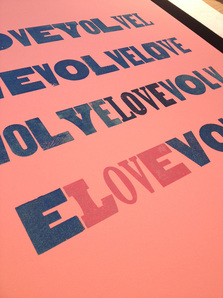
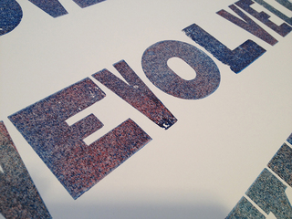
As I was organizing my storage room, I came upon my stack of Zanders calendars that I collected when I was in the ad biz. What a visual feast! On the cover of one was the word “Zanders” made of a unique typestyle. I used those seven letters as my inspiration and designed the rest of the alphabet.

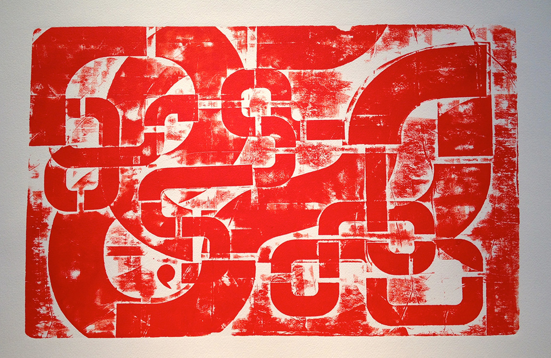
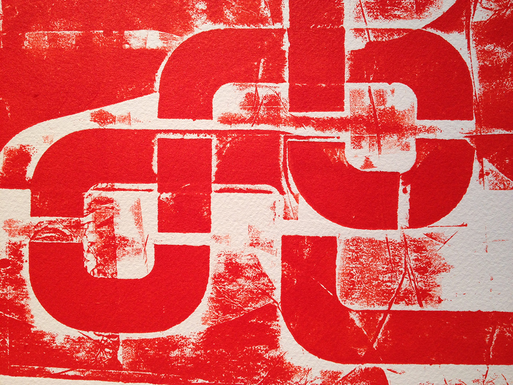
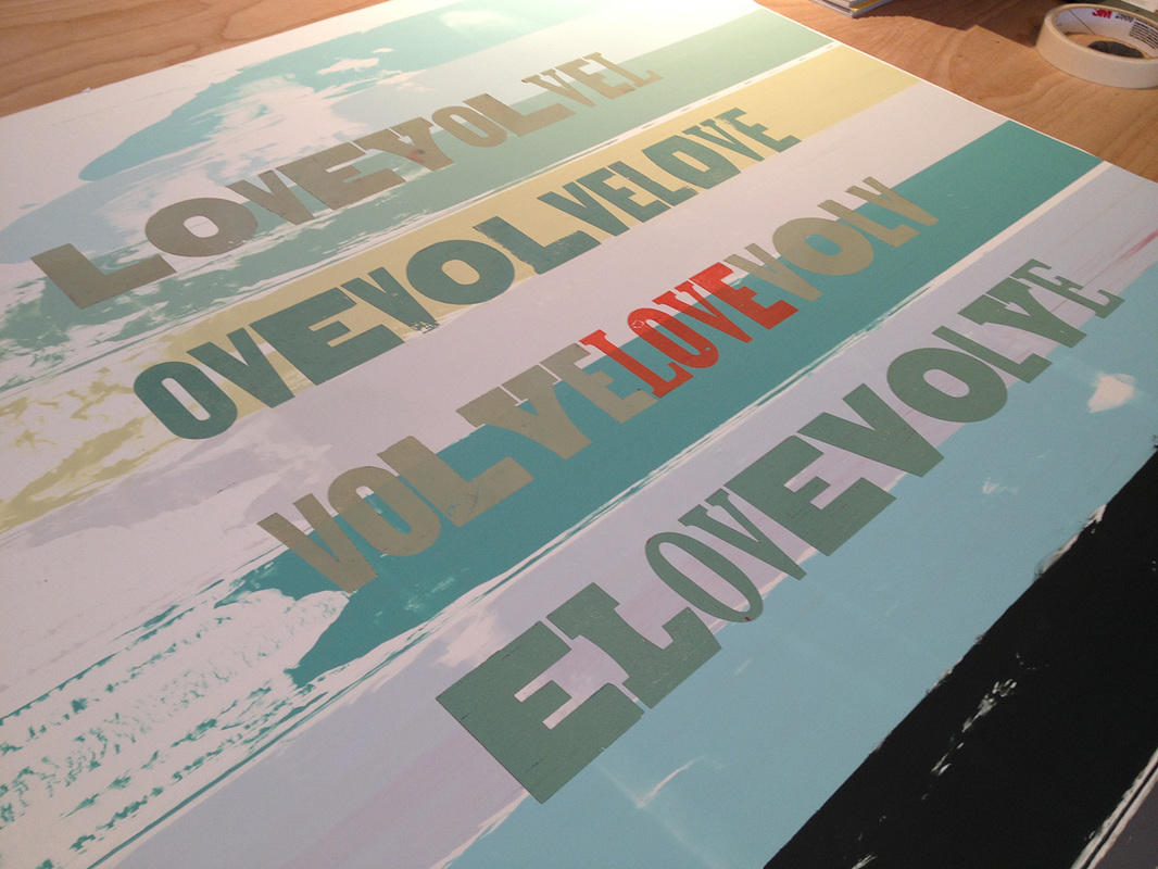
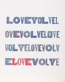
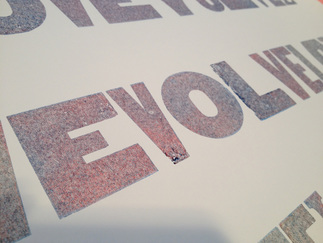
I approach encaustic painting with a silkscreen mentality (which means I use stencils) so the next step is to cut them. An appreciation for the colorfield artists added to the desire to complete this alphabet. I can envision that when my words stack up they’ll create a great pattern of vertical stripes which will be something that will interest me. I’ll report back.

Picture
Picture

Read More
0 Comments

Collage meets printmaking; what could be better?

6/5/2015

1 Comment

 
This winter I took a class to learn how to make mono prints. Fortunately, this teacher also taught collagraphy as I quickly learned that painting with ink on an acrylic surface was not for me. I work with stencils in a lot of my art and so I tried them with this medium. Hooked! This is work from my short class. I will explore more soon.

Before inking the plate I tried a blind emboss. (Thank you advertising background.) Love it. I need to build a bit higher. With a class like this I was not able to experiment with a second or third layer of ink. These monotypes are all made with one pass through the press.

Read More
1 Comment

Laziness & Letterpress

5/6/2015

0 Comments

 
My best friend and I have the good fortune to know the Assistant Director at Hamilton Wood Type & Printing Museum in Two Rivers, WI. So we took a trip there and spent three amazing days printing.

I discovered that rather than washing up in between colors that I could simply roll the new color on top of the old. After I printed what I had planned, I ran a number of pieces of paper through the press just to see what would happen. Magic!

As far as I can recall, I printed the green, then the blue, and then probably something else. Then I ran my extra sheets through the press starting with the pink one and then the two white sheets. Each pass took more ink off the letters in reverse order of how it had been layered on. It ended up that the inks mixed together on the letter which added to the excitement of the reveal.

Picture
Picture
Picture
Picture
Picture
Picture
Picture

Read More
0 Comments

    Author

    I am a mixed-media artist exploring the phenomenon between the visual and the verbal in encaustics, printmaking and drawing.

    Archives

    August 2016
    July 2016
    March 2016
    January 2016
    September 2015
    August 2015
    July 2015
    June 2015
    May 2015

    Categories

    All
    Concept
    Encaustics
    Letters
    Printmaking

    RSS Feed

Copyright © 2015 Audrey Riley